This is to show you the difference between sublimation ink and regular inkjet ink and the difference between what substrate (fabric) you use with sublimation- cotton, poly/cotton, and 100% polyester.
I’ll print the same image on 4 substrates- paper, cotton, poly/cotton, and polyester.
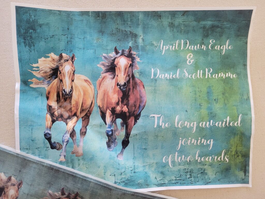
Paper- regular printer ink, printed on copier paper. I was checking the colors, look, and spelling.
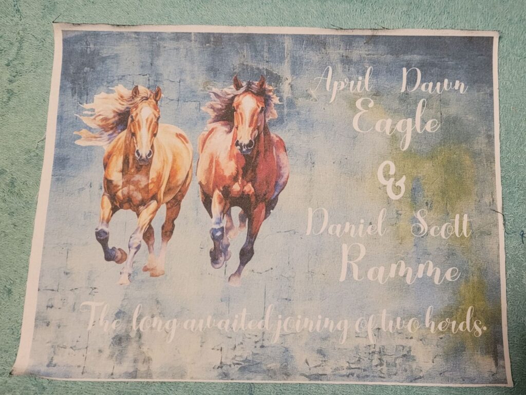
This is the label printed with regular ink on an inkjet printer on 100% cotton fabric. You see more blues than teals, but the image and letters are sharper. There is ink on the edges of the fabric and when you heat set the colors, they will stain the ironing cover, so lay a piece of muslin down first and cover it with another piece. Press both sides as hot as you can with no steam.
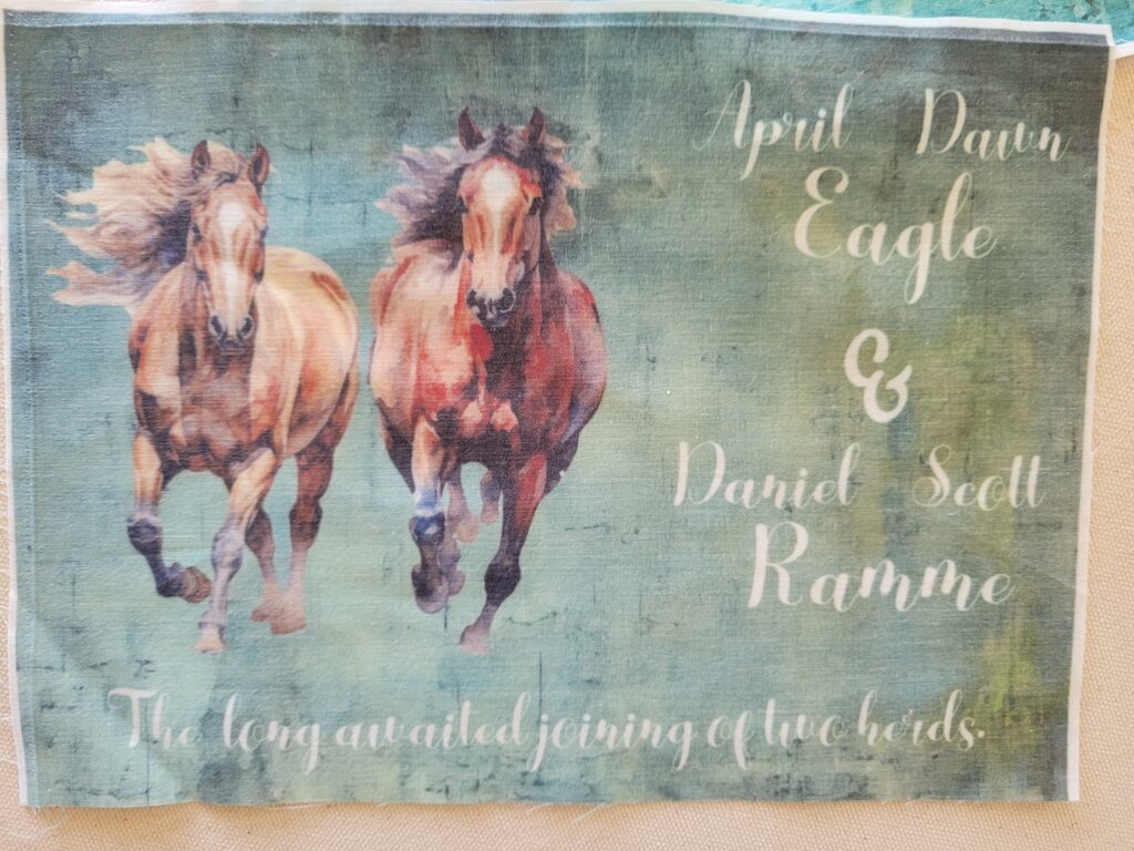
This next label is Sublimation ink on 30% cotton, 70% polyester. Because of the cotton content, the ink that did not bond to the cotton will slowly fade and will remain visible, but ghostly. While the lines are crisp, the colors can be quite dull compared to a side by side with 100% polyester. And to the eyes, the white can be seen through the photo. There are more teals coming through but it doesn’t look like the printed version.
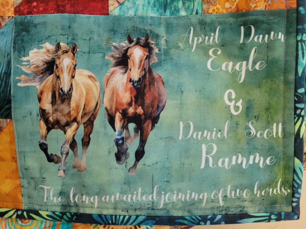
This is Sublimation on 100% polyester. Compared to the others this label is vibrant, the lines are crisp, the colors stand out, and it has depth. This label will remain crisp as it is repeatedly washed. The colors are come through but you don’t see all of the distressed look from the printed page.
Other Label pages
- Finishing your label– how to frame out your sew in label
- Label Sayings– what to say when you don’t know what to say
- Changes when washed– how the different substrates change when washed
- Look and feel– to interface or not to interface